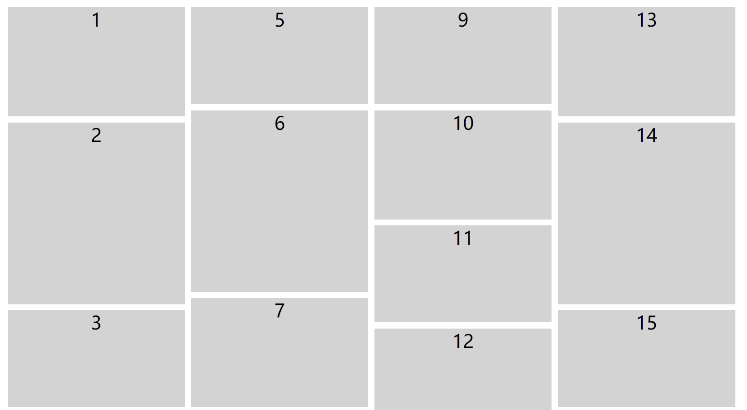
PC端效果
<!DOCTYPE html>
<html lang="en">
<head>
<meta charset="UTF-8">
<title>瀑布流</title>
<style>
.box {
width: 1200px;
margin: 0 auto;
/* 几列 */
column-count: 4;
/* 列间距 */
column-gap: 10px;
}
.box div {
height: 160px;
background-color: #d3d3d3;
margin-bottom: 10px;
/* 避免在该元素内部发生分页或者分栏 如果不够 排在下一列*/
break-inside: avoid;
color: #000000;
text-align: center;
font-size: 30px;
}
.box div:nth-child(2n) {
height: 300px;
}
.box div:nth-child(3n+1) {
height: 180px;
}
</style>
</head>
<body>
<div class="box">
<div>1</div>
<div>2</div>
<div>3</div>
<div>4</div>
<div>5</div>
<div>6</div>
<div>7</div>
<div>8</div>
<div>9</div>
<div>10</div>
<div>11</div>
<div>12</div>
<div>13</div>
<div>14</div>
<div>15</div>
<div>16</div>
</div>
</body>
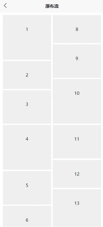
</html>移动端(uniapp)
<template>
  <view>
    <view class="lists">
      <view class="item" v-for="(item,index) in 15" :key="index">
        {{index+1}}
      </view>
    </view>
  </view>
</template>

<script>
  export default {
    data() {
      return {

      }
    },
    methods: {

    }
  }
</script>

<style scoped>
  .lists{
    padding: 20rpx;
    box-sizing: border-box;
    column-count: 2;
    column-gap: 10rpx;
  }

  .item{
    break-inside: avoid;
    width: auto;
    height: 200rpx;
    background-color: #eee;
    line-height: 200rpx;
    text-align: center;
    margin-bottom: 10rpx;
  }

  .lists .item:nth-child(2n+1){
    height: 240rpx;
  }
  .lists .item:nth-child(3n+1){
    height: 320rpx;
  }
</style>