这篇详细介绍一下三种用 CSS 画三角形的方法(附代码和效果图),之前面试的时候经常被问到,看完这篇你将彻底搞懂它们的实现原理。
方法一:通过边框(border)实现
平时给元素设置边框时往往设置为1px,如果边框再厚一些呢?比如20px:
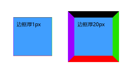
边框加厚后出现了四个梯形,可以想到边框越厚梯形会越高。如果继续加厚边框同时减小元素宽度呢?
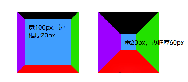
可以看出梯形的上底变短了,那如果元素宽度为0的话...
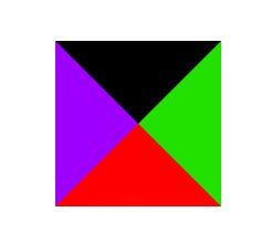
四个三角形!!如果我就想保留红色三角形,那把其他三个边框设置为透明色不就可以了!
.triangle {
    width: 0;
    height: 0;
    background: #409eff;
    border-left: 50px solid transparent;  /* transparent 透明 */
    border-right: 50px solid transparent;
    border-top: 50px solid transparent;
    border-bottom: 50px solid #ff0000;
}
/* 若去掉上边框 */
.triangle {
    width: 0;
    height: 0;
    background: #409eff;
    border-left: 50px solid transparent;
    border-right: 50px solid transparent;
    border-bottom: 50px solid #ff0000;
}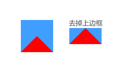
可以看到若想保留红色三角,则需将其他边框设为透明(对边去不去掉都行)。最后再去掉底色就完成了:
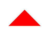
向下三角(黑色):
.triangle {
  width: 0;
  height: 0;
  border-left: 50px solid transparent;
  border-right: 50px solid transparent;
  border-top: 50px solid #000000;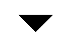
}向左三角(绿色):
.triangle {
  width: 0;
  height: 0;
  border-right: 50px solid #22e000;
  border-bottom: 50px solid transparent;
  border-top: 50px solid transparent;
}向右三角(紫色):
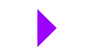
.triangle {
  width: 0;
  height: 0;
  border-left: 50px solid #9d00ff;
  border-bottom: 50px solid transparent;
  border-top: 50px solid transparent;
}
如果是指向四个顶点的三角形呢?
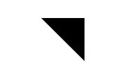
左上:
.triangle {
    width: 0;
    height: 0;
    border-top: 50px solid #000000;
    border-right: 50px solid transparent;
}
/* 同等效果 */
.triangle {
    width: 0;
    height: 0;
    border-left: 50px solid #000000;
    border-bottom: 50px solid transparent;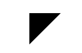
}右上:
.triangle {
    width: 0;
    height: 0;
    border-top: 50px solid #000000;
    border-left: 50px solid transparent;
}
/* 同等效果 */
.triangle {
    width: 0;
    height: 0;
    border-right: 50px solid #000000;
    border-bottom: 50px solid transparent;
}
其余两个大家自己试一试吧~
方法二:使用clip-path属性(更灵活)
clip-path 属性利用裁剪的方式创建元素的可显示区域
/* clip-path 的属性值有很多种写法,这里只讲实现三角形的写法 */
clip-path: polygon(x1 y1, x2 y2, x3 y3, ...)
通过定义多边形的顶点坐标(至少 3 个点)来裁剪元素。坐标以百分比或绝对单位表示,相对元素的尺寸计算
.triangle {
  width: 100px;
  height: 100px;
  background: #409eff;
  clip-path: polygon(50% 0%, 0% 100%, 100% 100%);
}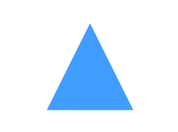
50% 0%:第一个顶点位于元素的x轴方向从左到右50%的位置,y轴方向从上到下0%的位置0% 100%:第二个顶点位于元素的x轴方向从左到右0%的位置,y轴方向从上到下100%的位置100% 100%:第三个顶点位于元素的x轴方向从左到右100%的位置,y轴方向从上到下100%的位置
polygon() 自动闭合路径(从最后一个点连回第一个点),图形外的内容(如文字、图片)不可见
方法三:利用background的linear-gradient()
linear-gradient() 是 CSS 中用于创建线性渐变背景的函数,能够替代传统图片背景,常用于按钮、卡片、文字特效等场景
background: linear-gradient(
  [方向或角度],
  [颜色1] [停止位置],
  [颜色2] [停止位置],
  ...
);
方向或角度(可选):
关键词:
to top、to right、to bottom left(默认to bottom)。角度:
0deg(向上)到360deg,顺时针计算。0deg= 向上(同to top);90deg= 向右(同to right)颜色停止位置:
至少需要两个颜色,格式为 颜色 位置(如
#ff6b6b 20%)。位置可用百分比或像素(如
50%、100px)
先画一个长方形:
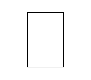
.triangle {
  width: 100px;
  height: 150px;
  border: 2px solid #000000;
}
加一个从左上到右下的渐变色图片(透明 -> 红色)试试:
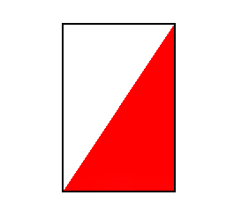
.triangle {
  width: 100px;
  height: 150px;
  border: 2px solid #000000;
  background-image:
    linear-gradient(
      to bottom right,  /* 朝右下角 */
      transparent 50%,  /* 左上半透明 */
      #ff0000 50%      /* 右下半红色 */
    );
}
这个像上三角的左半部分,能否再加上它的右半部分呢?在 CSS3 里,background-image 可以通过逗号分隔来叠加多个背景图像:
.element {
    background-image:
        url("image1.png"),  /* 最上层 */
        url("image2.png"),  /* 中间层 */
        linear-gradient(to right, #ff6b6b, #4ecdc4); /* 最底层 */
    background-repeat: no-repeat;
    background-position:
        center,  /* image1 的位置 */
        left top, /* image2 的位置 */
        right bottom; /* 渐变的的位置 */
    background-size:
        50%,   /* image1 的尺寸 */
        100px, /* image2 的尺寸 */
        cover; /* 渐变的尺寸 */
}规则:
层叠顺序:先写的图层在上层,后写的在下层 属性对应:其他背景属性(如 position、size)也用逗号分隔,按顺序对应每个图层默认继承:若某个属性值的数量少于图层数,浏览器会重复最后一个值。 (例如:两个背景图,但只写了一个 background-position,则第二个图的位置与第一个相同)
现在让我们挪动当前渐变的位置:

.triangle {
    width: 100px;
    height: 150px;
    border: 2px solid #000000;
    background-image:
        linear-gradient(
          to bottom right,  /* 朝右下角 */
          transparent 50%,  /* 左上半透明 */
          #ff0000 50%      /* 右下半红色 */
        );
    background-position: left;
    background-size: 50%100%;
    background-repeat: no-repeat;
}
右侧再加一个镜像方向渐变的图片:
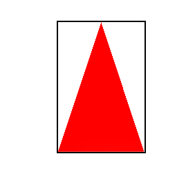
.triangle {
    width: 100px;
    height: 150px;
    border: 2px solid #000000;
    background-image:
        linear-gradient(
          to bottom right,  /* 朝右下角 */
          transparent 50%,  /* 左上半透明 */
          #ff0000 50%      /* 右下半红色 */
        ),
        linear-gradient(
          to bottom left,  /* 朝左下角 */
          transparent 50%,  /* 右上半透明 */
          #ff0000 50%      /* 左下半红色 */
        );
    background-position: left, right;
    background-size: 50%100%, 50%100%;
    background-repeat: no-repeat;
}
最后去掉边框即可。
再尝试一下其他方向的三角形:
向下三角:
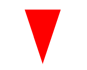
.triangle {
    width: 100px;
    height: 150px;
    border: 2px solid #000000;
    background-image:
        linear-gradient(
          to top right,  /* 朝右上角 */
          transparent 50%,  /* 左下半透明 */
          #ff0000 50%      /* 右上半红色 */
        ),
        linear-gradient(
          to top left,  /* 朝左上角 */
          transparent 50%,  /* 右下半透明 */
          #ff0000 50%      /* 左上半红色 */
        );
    background-position: left, right;
    background-size: 50%100%, 50%100%;
    background-repeat: no-repeat;
}向左三角:
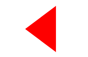
.triangle {
    width: 100px;
    height: 150px;
    border: 2px solid #000000;
    background-image:
        linear-gradient(
          to bottom right,  /* 朝右下角 */
          transparent 50%,  /* 左上半透明 */
          #ff0000 50%      /* 右下半红色 */
        ),
        linear-gradient(
          to top right,  /* 朝右上角 */
          transparent 50%,  /* 左下半透明 */
          #ff0000 50%      /* 右上半红色 */
        );
    background-position: top, bottom;
    background-size: 100%50%, 100%50%;
    background-repeat: no-repeat;
}
最后再画个风车吧~
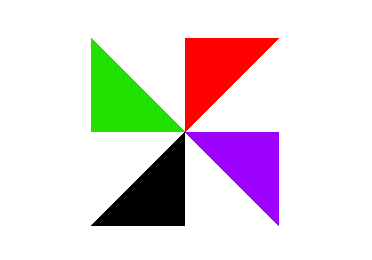
.item3 {
    width: 150px;
    height: 150px;
    background-image:
        linear-gradient(
          to bottom left,  /* 朝左下角 */
          transparent 50%,  /* 右上半透明 */
          #22e000 50%      /* 左下半绿色 */
        ),
        linear-gradient(
          to top left,  /* 朝左上角 */
          transparent 50%,  /* 右下半透明 */
          #ff0000 50%      /* 左上半红色 */
        ),
        linear-gradient(
          to bottom right,  /* 朝右下角 */
          transparent 50%,  /* 左上半透明 */
          #00000050%      /* 右下半黑色 */
        ),
        linear-gradient(
          to top right,  /* 朝右上角 */
          transparent 50%,  /* 左下半透明 */
          #9d00ff 50%      /* 右上半紫色 */
        );
    background-position: left top , right top, left bottom, right bottom;
    background-size: 50%50%, 50%50%, 50%50%, 50%50%;
    background-repeat: no-repeat;
}